


Midweek Charts
Charts from a range of markets

Hello, and welcome back to Celeritas Capital! In this article we will share some interesting charts we have come across recently. Along with quick thoughts on each chart. Let us know if this is something you find helpful or interesting and we will make it a weekly series!
SPX:
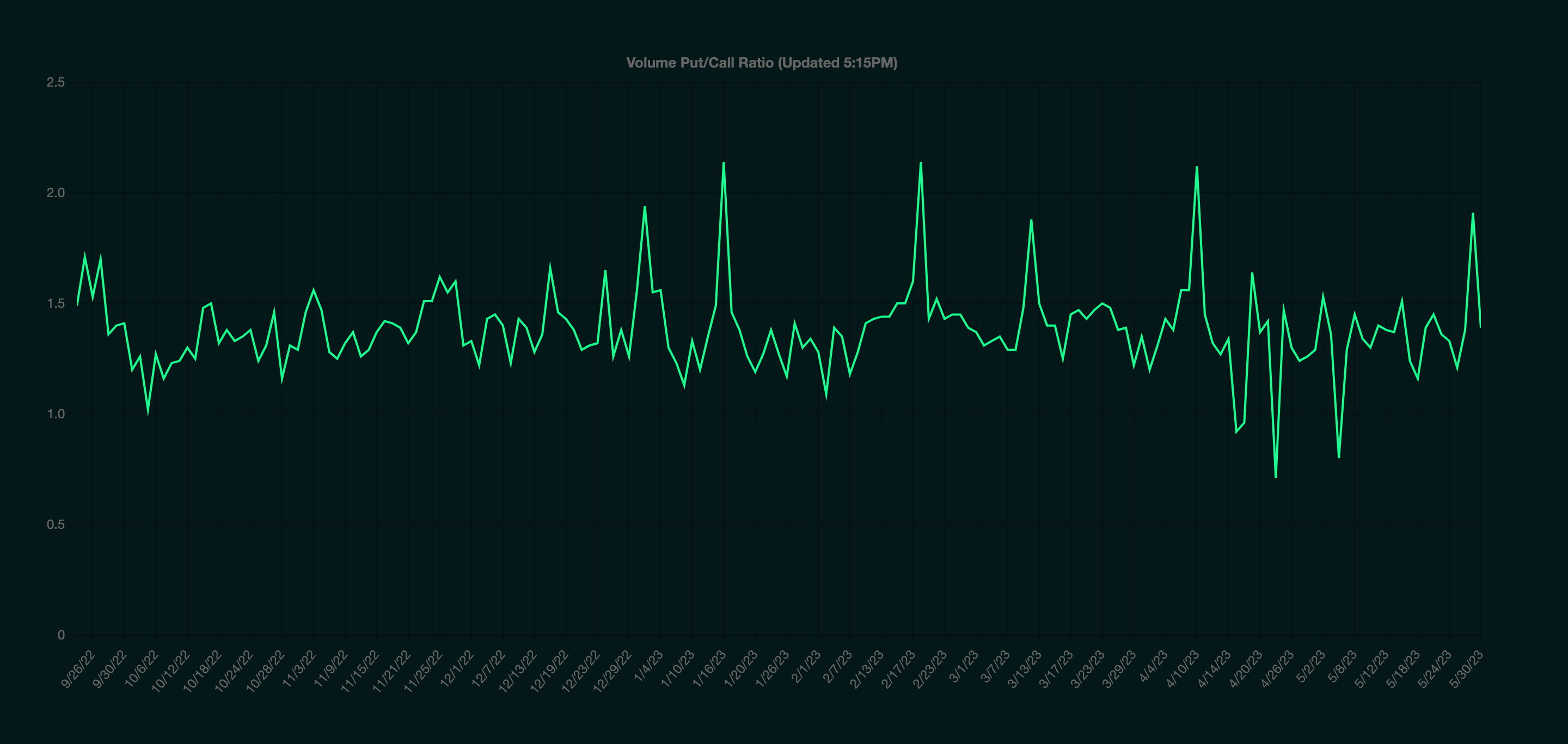
Below in Figure 1 is the Put/Call ratio for the S&P 500 index (SPX) as 5/30/23, 11:23PM (EST). It appears market participants are slightly more bullish.
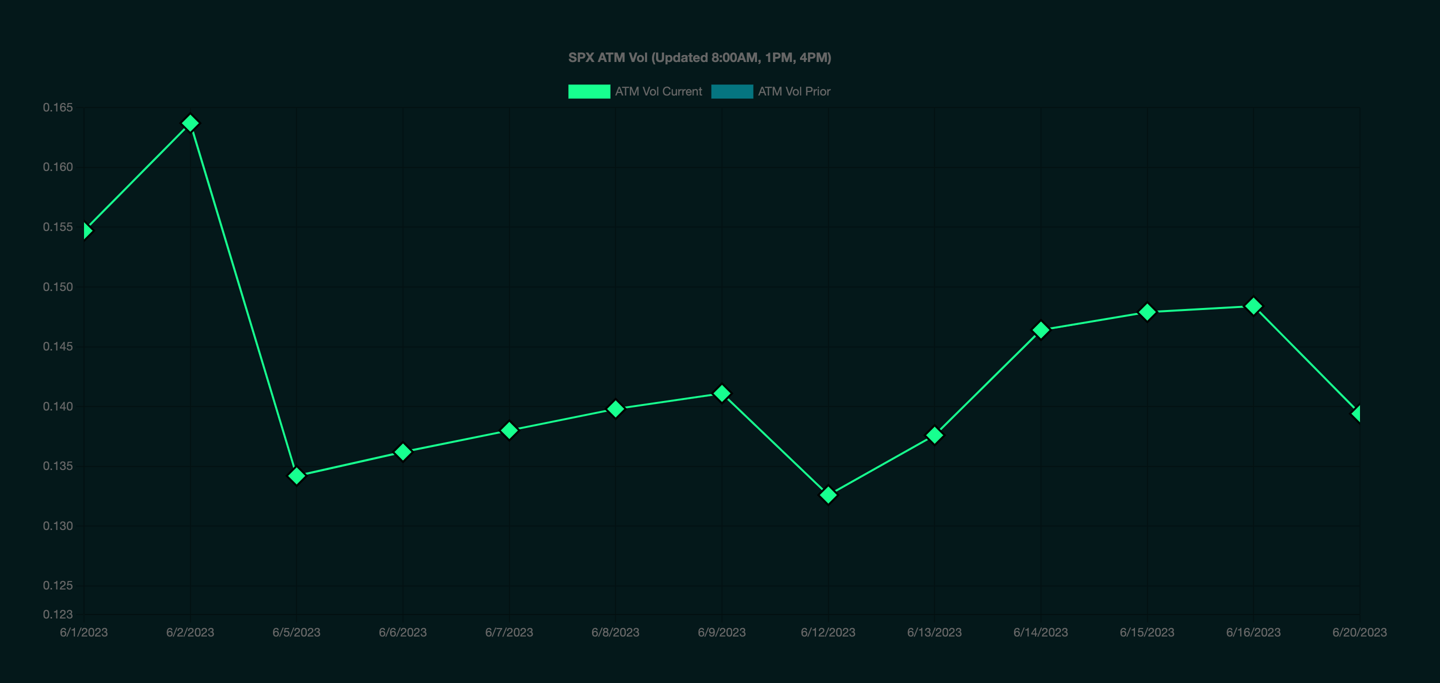
In the second Figure also from GammaLab we have the current at the money (ATM) volatility structure for SPX. Note the sharp decline in volatility after Friday 6/2, this is a good visual in our view to see how market makers are pricing in volatility during this week’s economic releases. (Figure 2)
Tech:
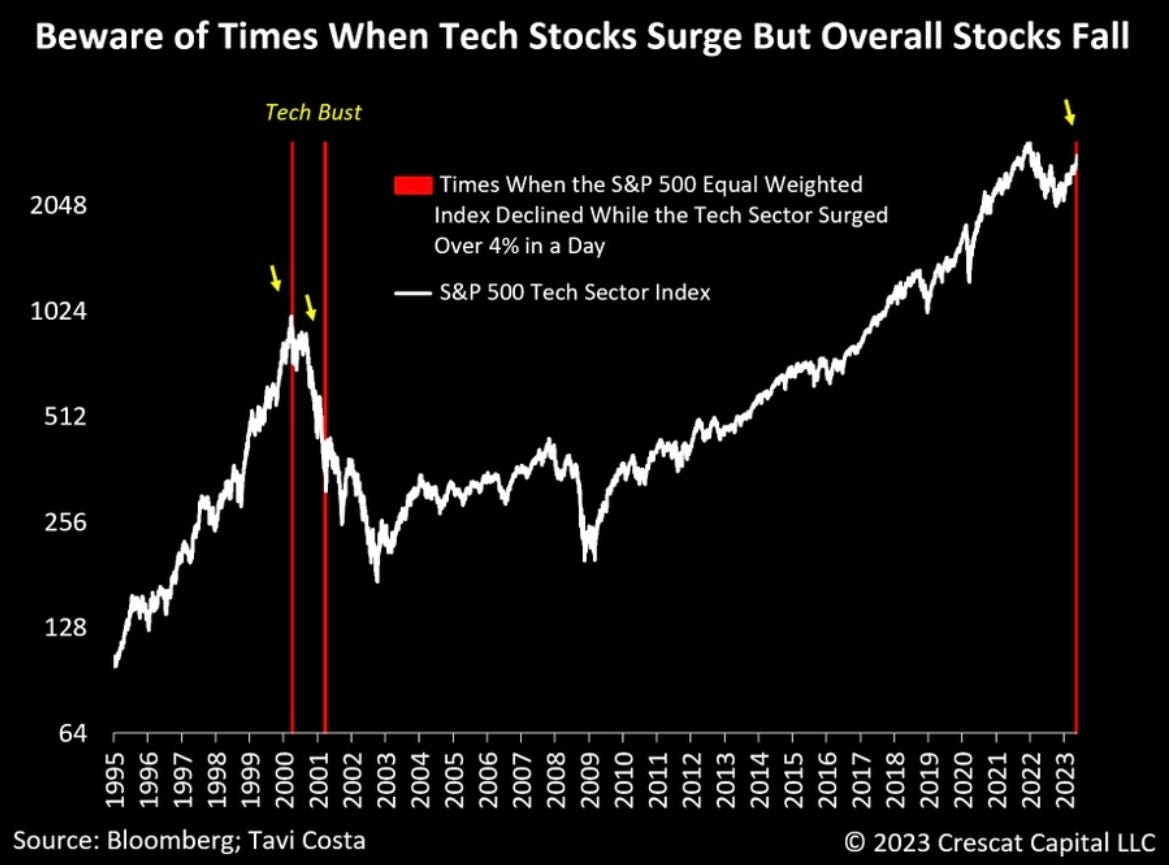
History doesn’t repeat but it often rhymes. Are we in for another tech crash? Figure 3 gives some insight.
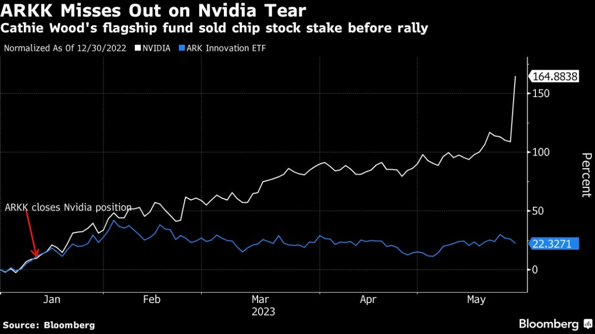
Don’t let Cathie Wood “invest” your money. Or do we are not your financial advisor. (Figure 4)
Macro Economics:
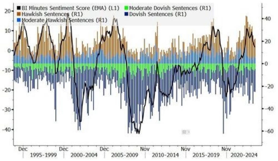
Figure 5 is a neat chart showing how the FEDs sentiment changes.
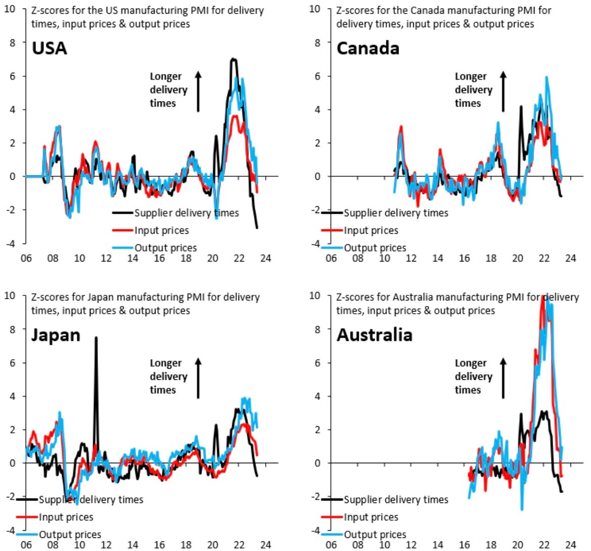
In Figure 6 the PMI z-score for a variety of economic measurements in the USA, Canada, Japan & Australia.
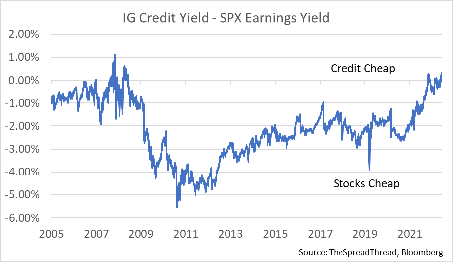
Be careful buying the dip in stocks here. (Figure 7)
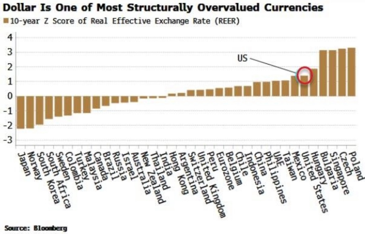
After the debt ceiling is in the rear view mirror the US dollar could be a good short. (Figure 8)
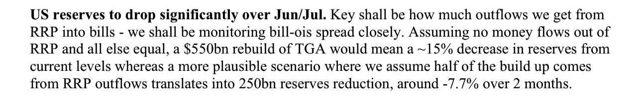
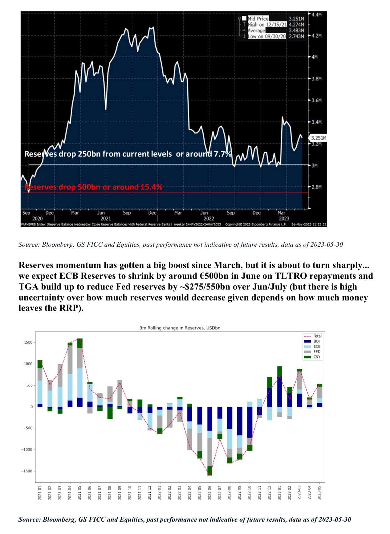
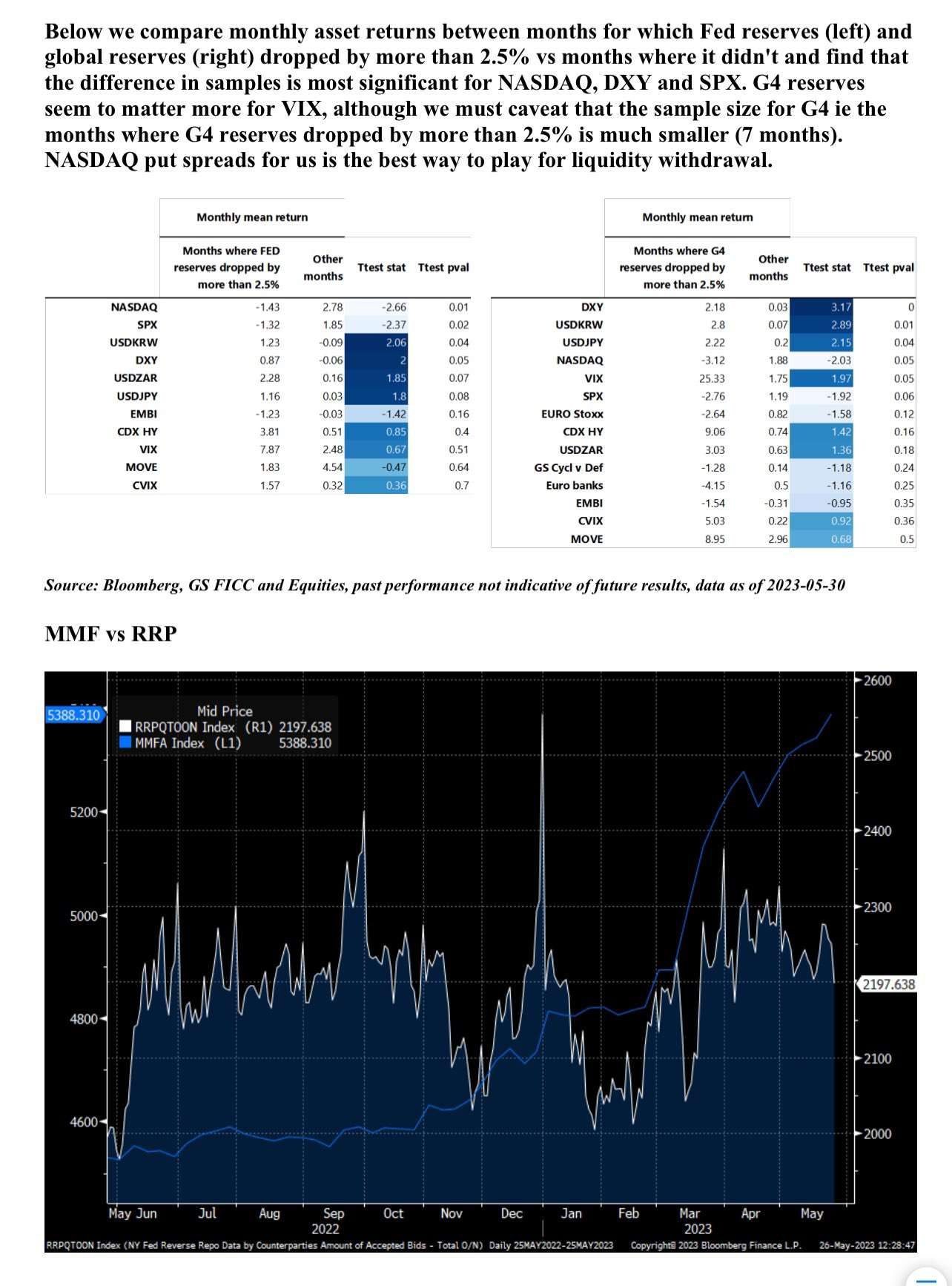
Finally we would like to share some information about market liquidity. It is our view and many others view that central bank liquidity particularly from the FED has been helping fuel this equity market rally. However, this excess liquidity is likely to dry up in June and July. (Figure 9) We recommend reading Goldman’s insight on this which is in Figure 10 and Figure 11.
DISCLAIMER: We are not Financial Advisors, and all information presented is for educational purposes ONLY. Financial markets can be extremely volatile, as such using good risk management is a must.